Paradis Basics

From the sea, to the city.

Design 1


Design 3 (printed)
The marble blue bottles did okay, people seemed to like our mission of creating reef safe sunscreen that wouldn't disrupt your endocrine system.
In our on going education in design developed, our taste developed and we quickly became dissatisfied with this design and offerings. We scrapped everything, even the company name and started over.

Starting again, again

Design Anthology

Design 2


Learning to focus

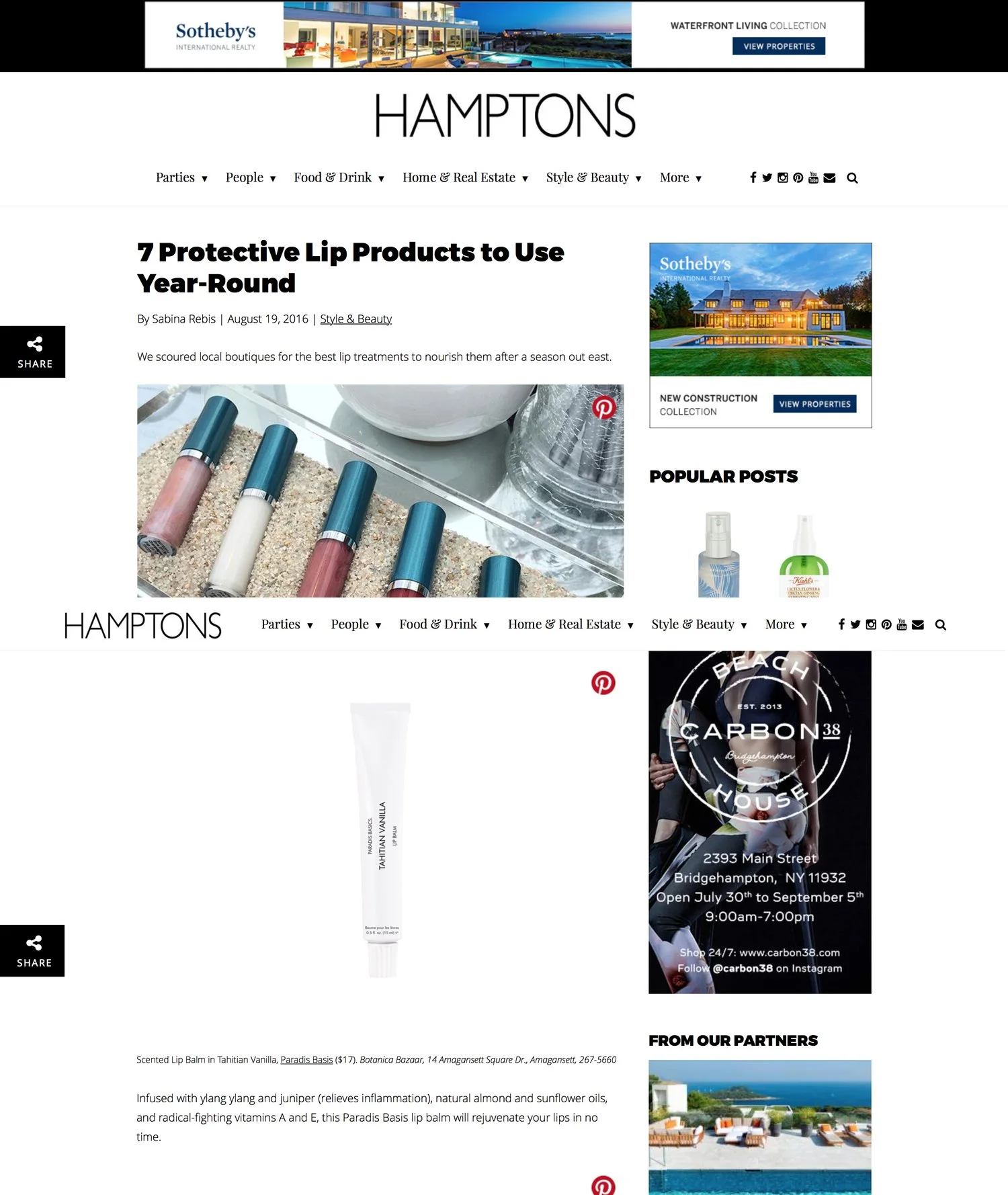
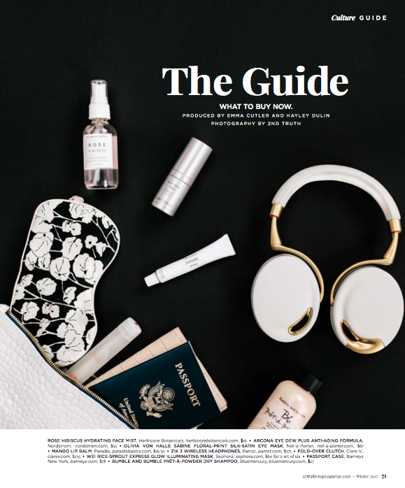
Hamptons Magazine
Non-toxic skincare
2013-2017
San Francisco, CA
The Problem
In 2013 the design of both packaging and formulation of skincare products were stale & somewhat toxic in formulation.
Users
The target users of are young health concisions professionals with high income who work in the creative industries. Because these users tend to be affluent and active, their spending habits are generally focused on technology, health/fitness, and travel. This target audience also cares about their interior home aesthetics and sharing their lifestyle on in the internet, thus aesthetics are important. They seemed frustrated with the current design offerings, some even going as far as rebottling supermarket brands in blank packaging. The formulations were not evolving with the modern consumer demands.
Team & Role
I worked closely with a team of chemist, a PM, public relations, and several third-party stakeholders (retailers, banks, legal, models). As the Lead Product Designer on this project, I designed all products Paradis Basics including packaging. I built the base for our digital presence including the website, blogs, social media content. I carried out product photography as well as marketing campaigns with 2 assistance. I tested the formulations and designs with users, rapidly iterated, and delivered innovative formulations in a quick and innovative manner
Design Process
When we started Paradis our design skills were lackluster to be generous. We had to quickly and deeply increase both our technical skills and taste. To hold ourselves accountable we designed in public and shipped often. We attempted to create a feel of luxury, though having experienced it, none of us actually knew how to create it, or even what it meant.
We first started the company as SAPPHIRE&. The thinking was that we could extend the name to marketing inclusivity like Sapphire& Sun, Sapphire& Surf, Sapphire& Ski. Our first products were mineral based sunscreen(2013) and tanning oil. The mineral sunscreen was because as avid surfers and general beach people, we cared about the ever dying reef due to chemicals in sunscreen, we sought to change that.
With my limited design skills and Photoshop I mocked up a label printed on office paper on a bottle with tape and put it on my Instagram for rapid feedback from my friends.
After many iterations our V1 was a marble print (which to my defense was in at the time, taste was still low)
We moved towards more sustainable materials and this was iterations moving to V2.
The dark aesthetic was not well received by our audience when we put it on our story. It was important to us that our customers felt like they were apart of the design and creation process, like they were in the studio with us.
We found these really cool copper tubes from a molecular gastronomy site and when we showed them to our customers, our DM's were flooded.
We refocused our offerings at the same time from sunscreen to lipbalm as it could have more possibilities for audience development. Our goal during this time, was to focus.
We iterated on the copper tubes and lip balm. Again we taped a mock label on printer paper straight on to the tubes and put it up for our customers to see and participate.
Final Print Copper Series
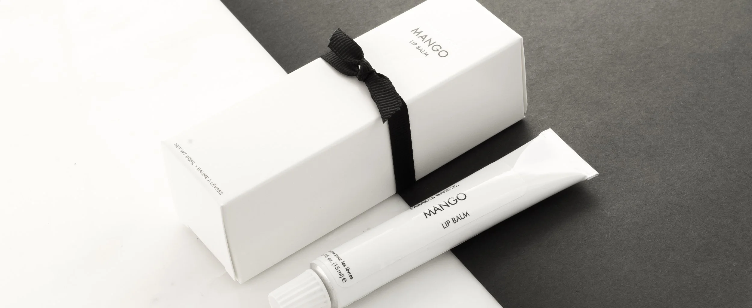
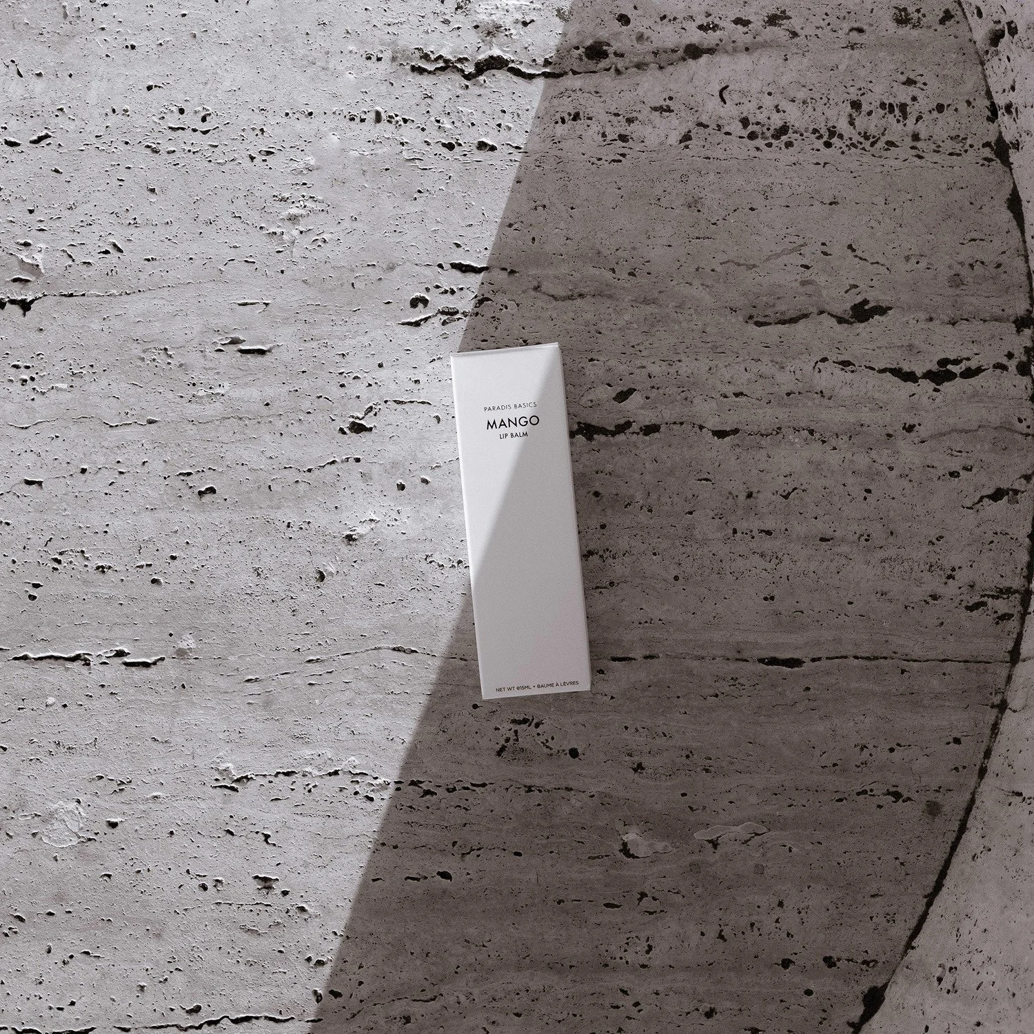
After a few iterations we decided to scrap everything and restart as Paradis Basics and just focusing on lip balm.
We found that focus especially as a small company was really important, it gave us a chance to compete in the marketplace, being small we were agile and could update instantly. Focusing allowed us to go deep and try to be really good at what we did. This sentiment was reflected in the rapid increase in sales, retailers stocking our product and magazine/press features. We landed in some of the most prestigious design magazines and niche sought after destinations.
Final product iteration. We focused on reducing the superfluous and making the necessary; extraordinary.
Impact
We found the process of creating, focusing, listening to customer feedback, then iteration to work well.
Improvements
We stayed in the “attract, don’t chase” ethos for too long. We didn’t do any sales or ads. Once the product was at a stage where it clicked with taste-maker/initial users, we should have pushed sales. If we pushed it too early it would never have forced us to improve our product but once we had it worked out, we should have made a tremendous effort to tell the world.
